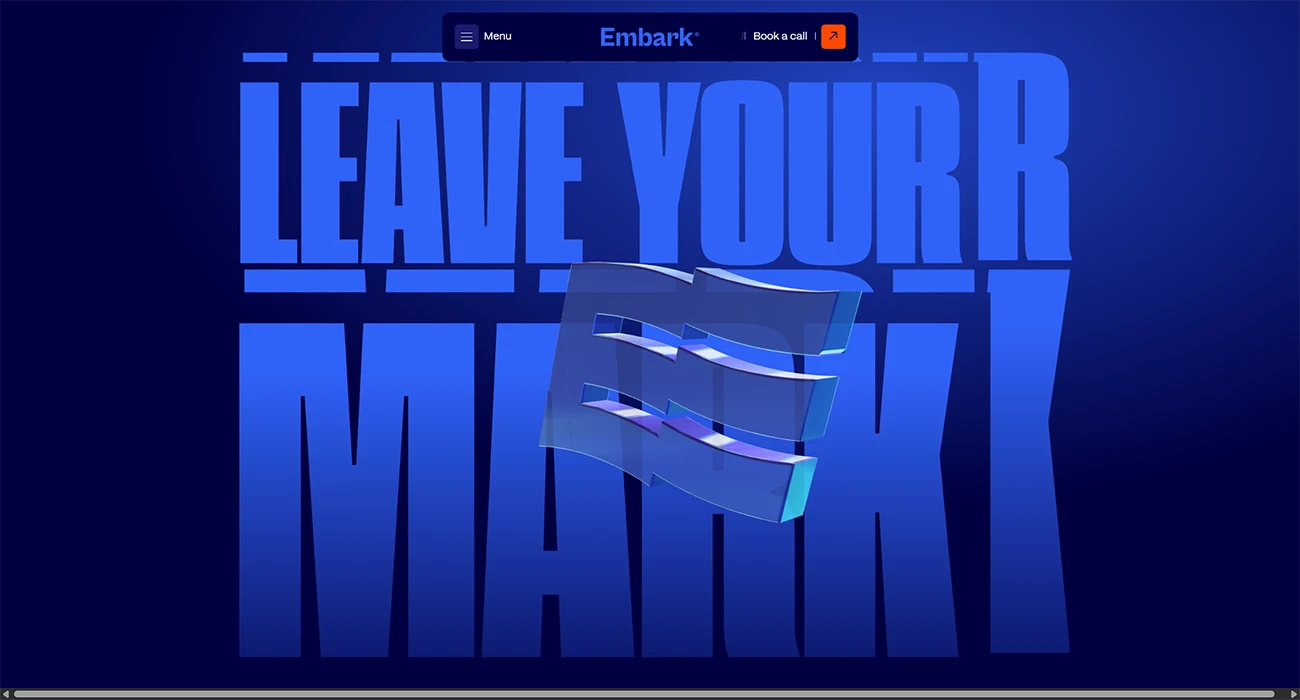
Most agency websites look the same: minimal, white and safe. Embark Agency‘s old site was no exception, and it did not sell the strategic thinking that sets the agency apart. When Embark rebranded last year, the team set itself a harder brief: break the mould, but stay relevant to the established business owners it wants to work with. A brand agency rebranding itself, then building the site to prove it.
Embark is a team of five, and the site was designed, built and written entirely in-house. One developer built it around live client work, on a real-world budget, across more than 250 hours of combined effort.
The result is a deep blue, strategy-led site that refuses to blend in. Generous white space, one confident call to action and a three-dimensional version of the new logo stop people the moment they land. Navigation runs through an interactive pill menu that works like a website within a website, giving instant access to every service, project and article, with touch-first carousel browsing for the agency’s work and insights.
Underneath the calm surface is a fast, lean build. The site is headless: WordPress runs quietly as the content engine, Astro builds a light front end, and Vercel serves it globally from the edge. On Google PageSpeed Insights the desktop experience scores 90 for performance, 91 for accessibility and 100 for best practices, with zero layout shift.
The site is also built for how people search now, with structured content for both traditional and AI-powered search. In the fortnight after the June launch, organic clicks nearly doubled, average Google position climbed, and the site posted its highest impression days on record. Client trust leads the experience, with Embark’s 4.9 Google rating and real client stories front and centre.